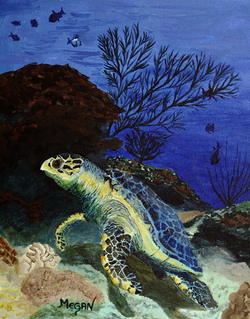
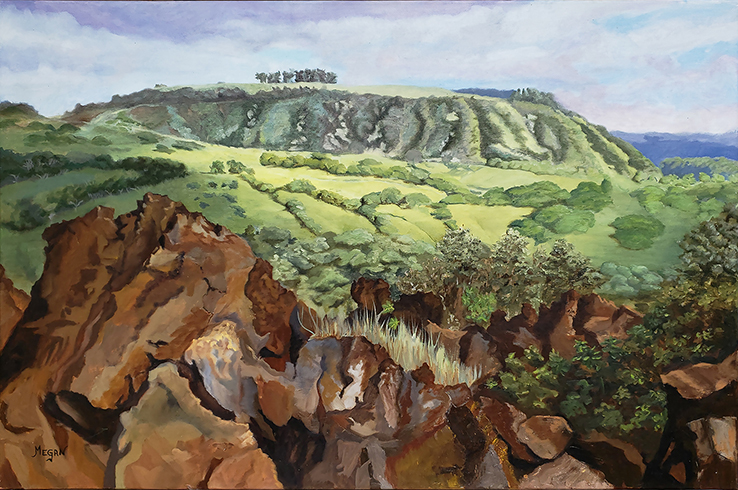
There is a lot of talk lately about using “neutral” palettes to mix paint, that somehow it helps you get your colors closer to what you want them to be. Most of us start with a white palette to mix our paints on. I tried something different. Since I was looking for specific colors to make my fish become part of the background of the painting, I printed out a copy of the picture I was using for the images and put it behind my glass palette. By the way, I always use a piece of glass for my palette, that way I can just scrape it clean with a razor blade.


If you look at the white palette, that blue color is an attempt at what would be “white” under water and a longer way away. When you look at the same color on top of the photograph, it is almost a perfect match for “white”! For the record, white, is almost never white. In fact, all colors are relative to the colors they are beside.
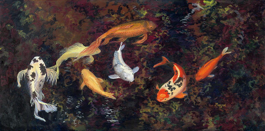
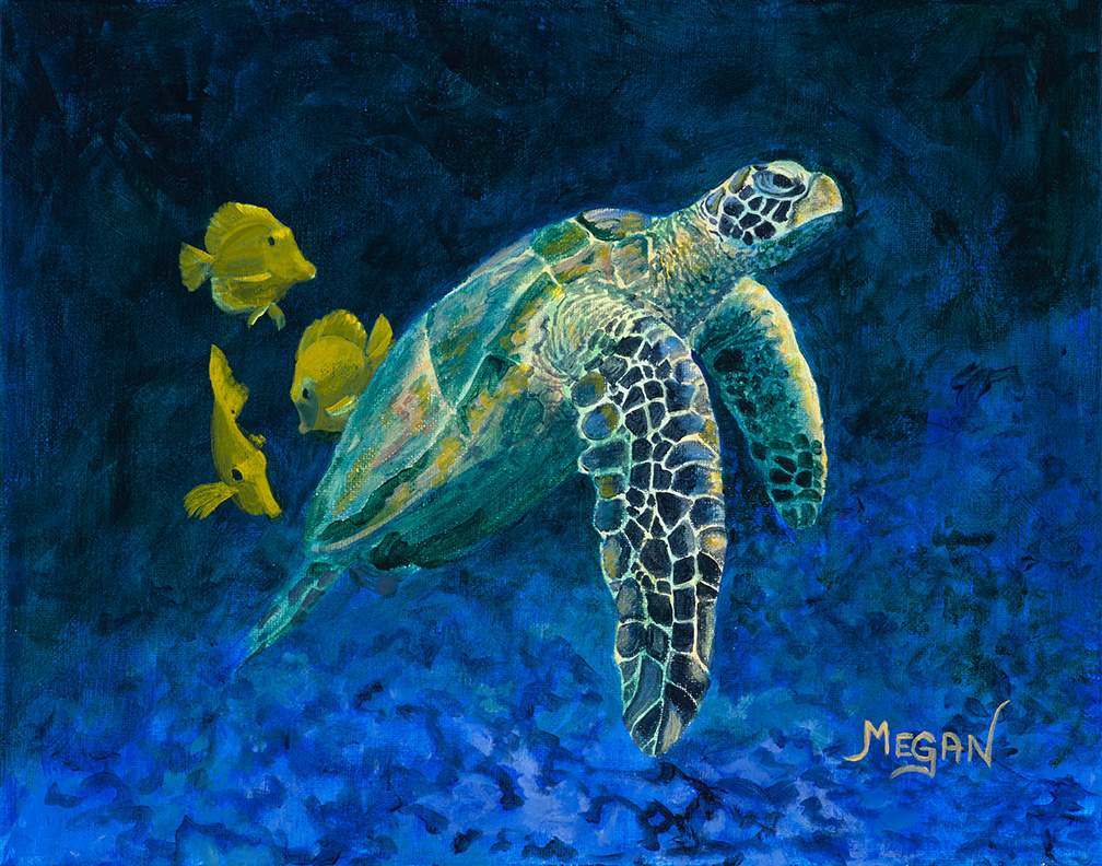
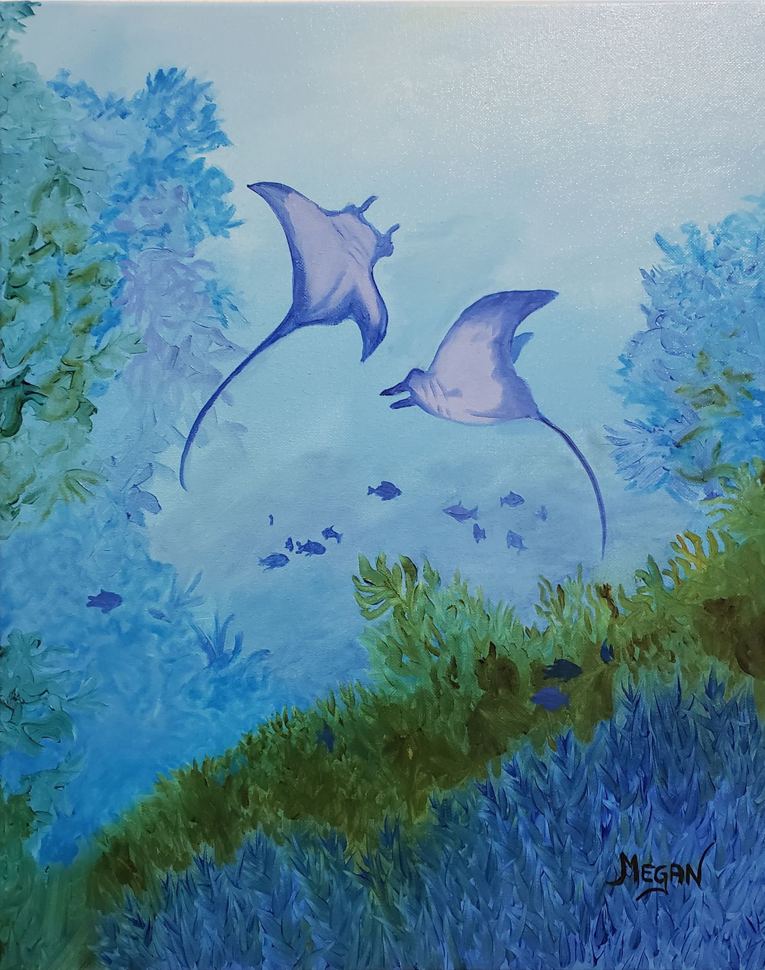
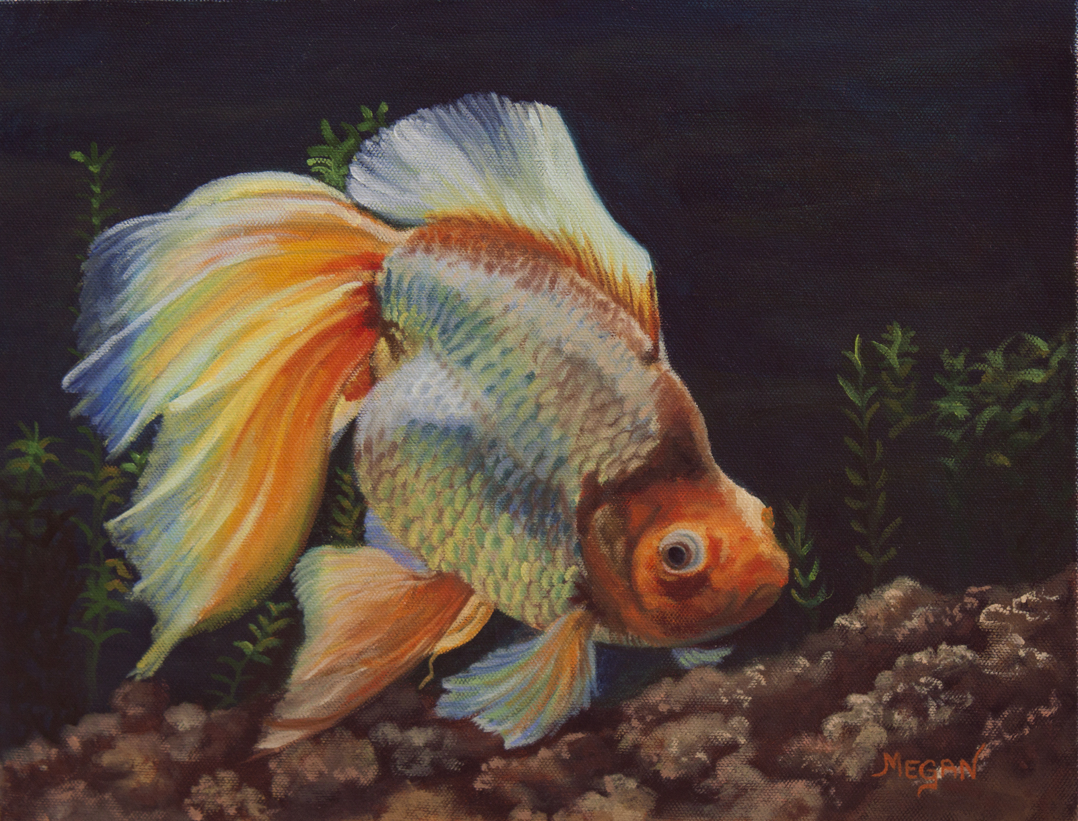
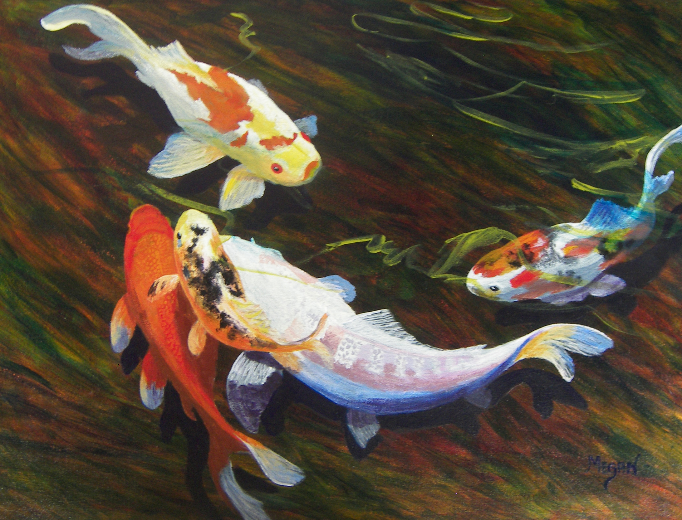
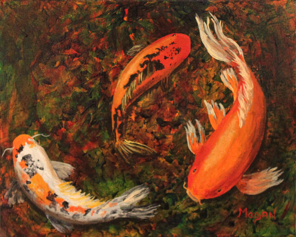
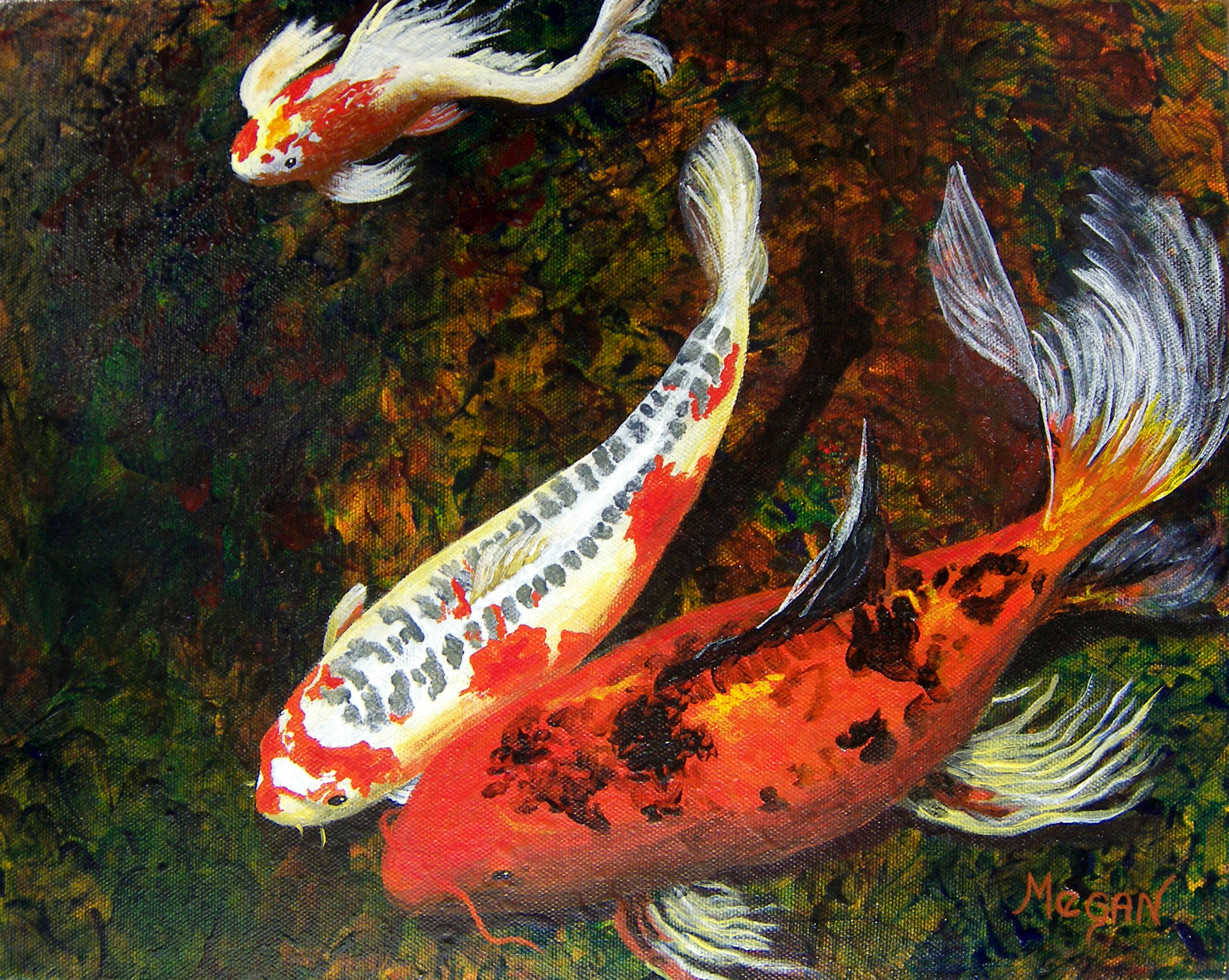
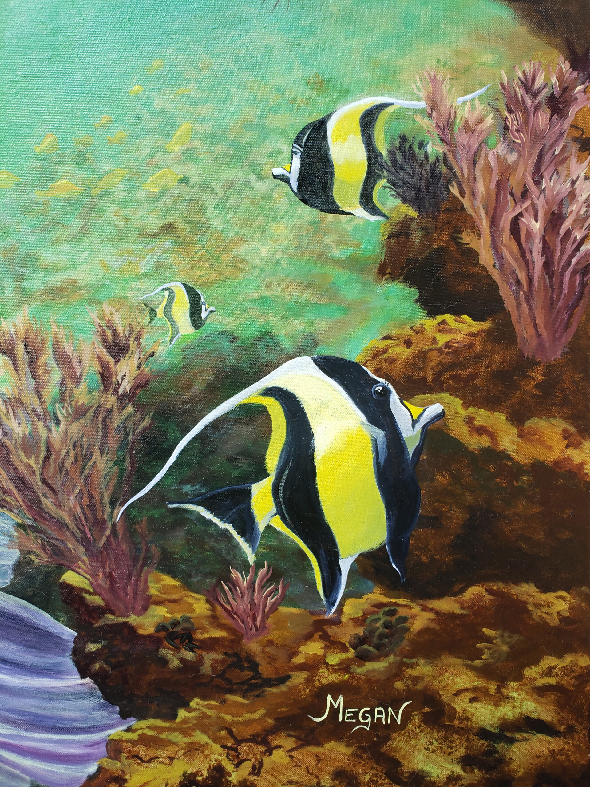
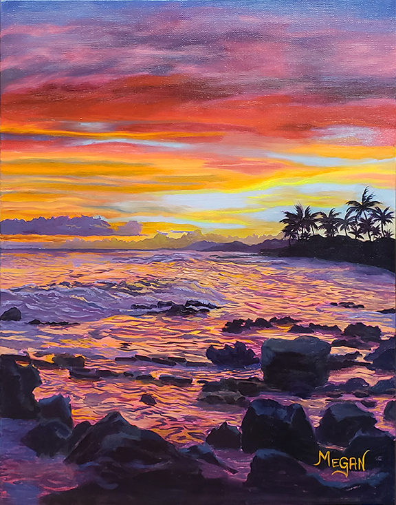
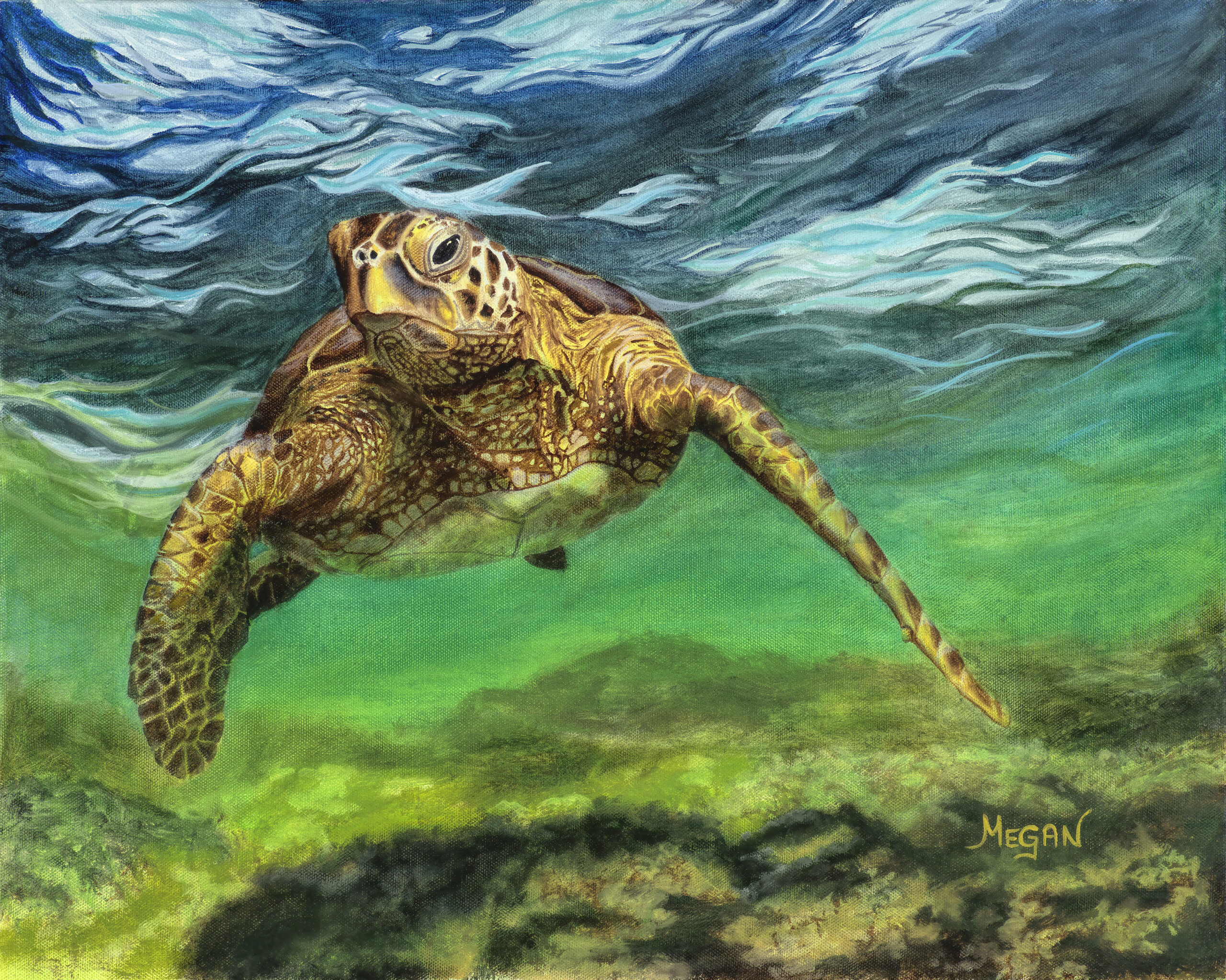
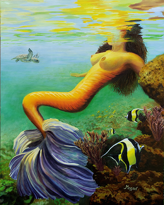
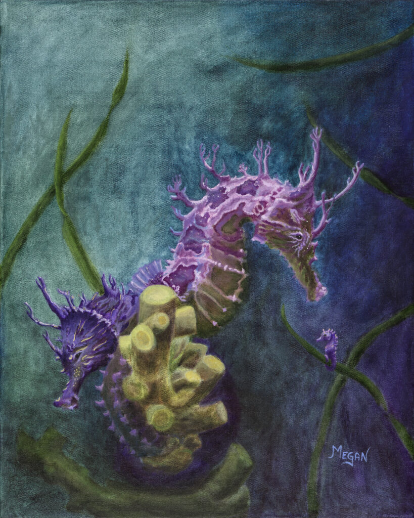
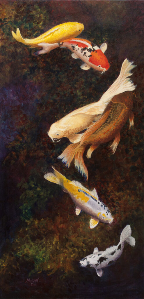
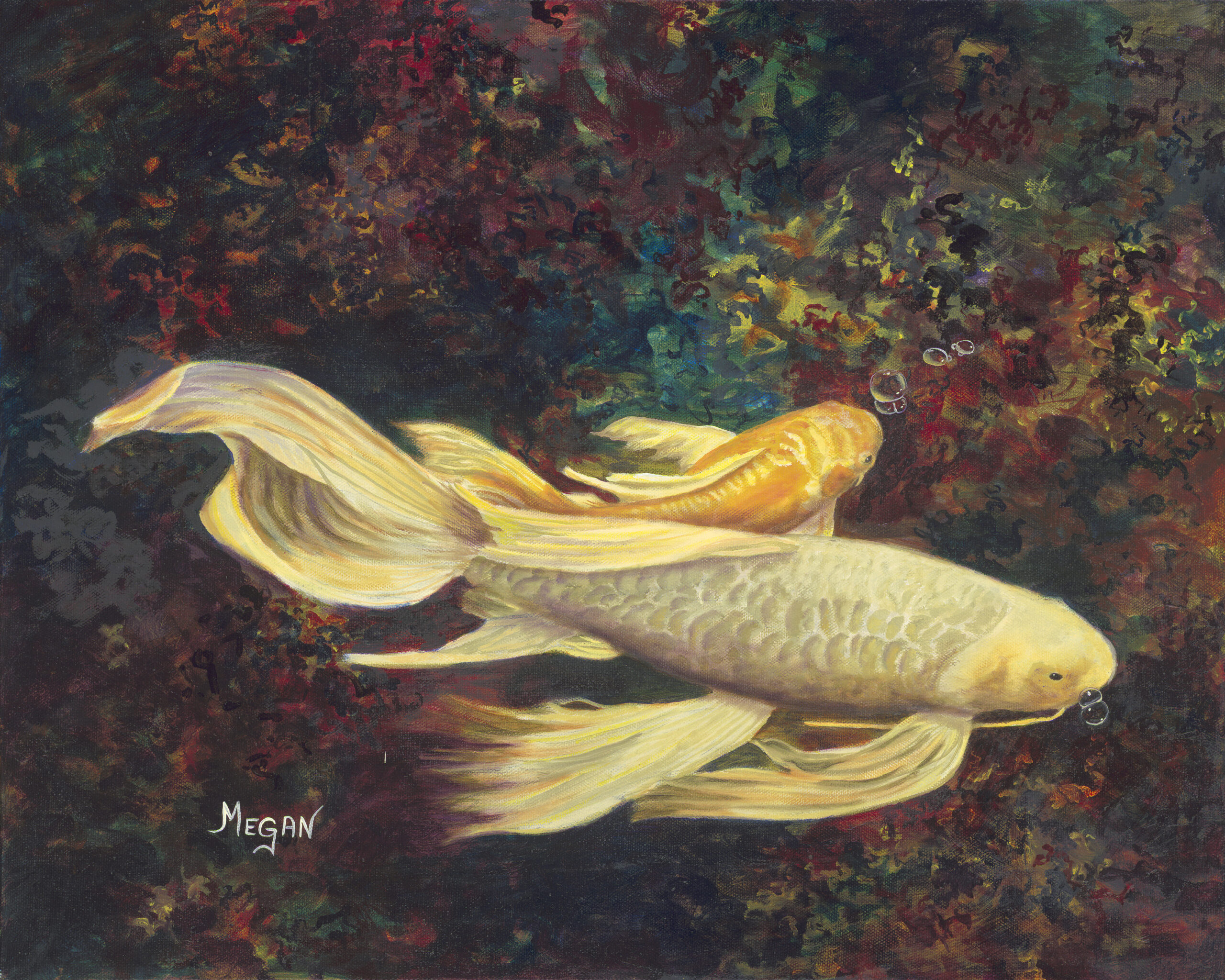
Finally, here’s a picture of some of the fish I finally painted: As crazy as it seems, they may still be too bright. I’ll have to wait until I add more to make that determination.


Leave a Reply